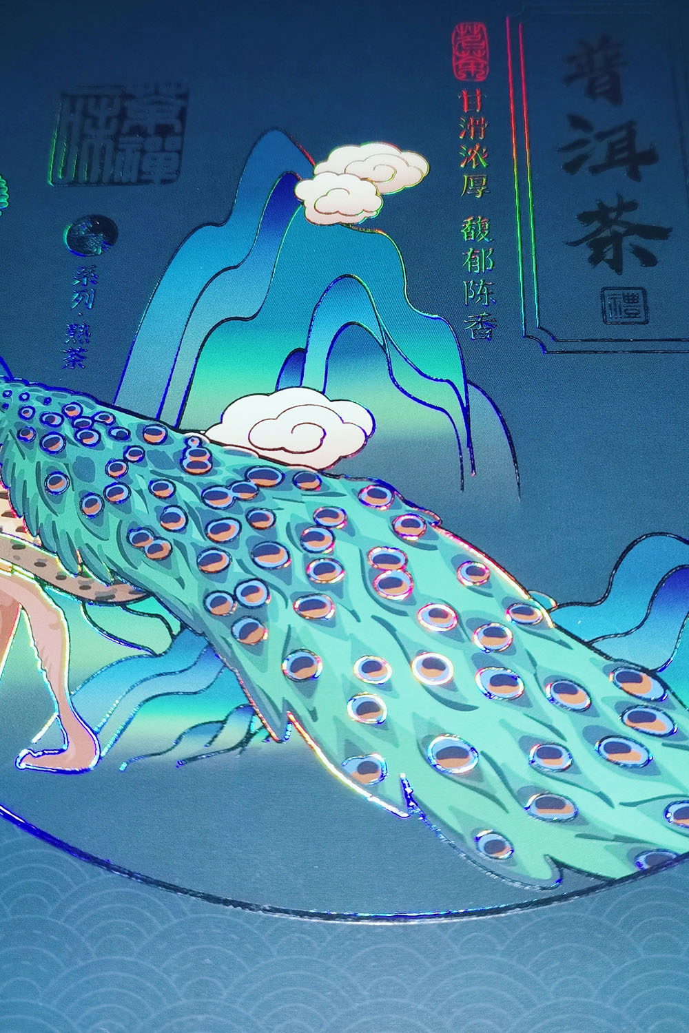
Color is the main artistic language of packaging design, which has more visual impact and abstract characteristics than composition, modeling and other expression language, and also can play its attractive charm.
At the same time, it is an important element to beautify commodities and show the image of enterprises and products. As a qualified packaging designer, we should not only systematically master the basic theoretical knowledge of color, but also study the color characteristics of commodities, understand the differences of regional and cultural background, and be familiar with people's color habits and hobbies, in order to meet the dry and changing consumer market.
The following is to analyze the characteristics of colors in packaging:
1. The attention of color
Packaging has many functions, among which the most important function is to convey product information.Packaging design is in the limited area and space to do something, and because the buyer is in a short time to feel and understand the design object, this kind of time and space limitations, decide packaging decoration color visual transmission signal strong, must attract attention, arouse visual excitement, cause potential consumer demand active activities, through the first intuition, to leave a deep impression on consumers. Therefore, in order to strengthen the attention of packaging decoration color, we should pay attention to the following three points in the design:
First, keep your colors simple.
As far as the color of packaging design is concerned, it generally belongs to the category of decorative color, which mainly studies the juxtaposition of color blocks to give consumers a feeling of beauty. There are not many kinds of colors, and the stacking effect of a variety of colors is not always good. Colorful colors make people dazzling, and the visual intensity will be weakened in a certain space distance.
Experienced designers know the value of color as gold, with less than more truth, according to the principle of psychology, one set of colors than two sets of colors transfer quickly, the relationship between them is inversely proportional, fewer colors, clear primary and secondary, clear hierarchy, can give fruit into the concise overall. From the perspective of product content, color should be refined, summarized and symbolic. From the perspective of economic benefits, less color can reduce costs and benefit merchants and consumers.
Secondly, the color with high visibility should be selected. The so-called "visual impact" is strong or weak, mainly refers to the color brightness and purity difference. Solid colors have greater visibility than some light colors, intermediate colors and shades of color. Bright colors, warm colors and high purity colors are easier to see. Of course, this is not to say that you can't use low visibility color, if the visibility of low color, such as gray color, light color, dark color and high visibility color appropriate match, there will be a very good effect.
In addition, the attention of color and its background color has a close relationship, shape color and background color contrast, increase the attention of color.
In addition, is to consider in the same consumer market and the same kind of goods on the shelf, you design the color of the product packaging and the color of other goods produced by the contrast relationship, which is also an important factor to cause attention.
2. The subordination of color
Like other literary and artistic forms, the fundamental principle of packaging design art is that content determines form and form serves content. The color of product packaging design is generally decorative color. The color treatment of decorative color belongs to the form category. Although it has its independence, it belongs to a certain product content after all. Therefore, the determination of regional packaging design color only by the designer's imagination is not workable, must be subordinate to the quality of goods, category, grade, sales object and sales region. Designers should first understand the packaging characteristics of similar products in the sales market, and determine the positioning of the design on the basis of market information research, otherwise they will fall into the blindness of the design.
In the use of color must be according to the content of different products to do the right medicine. Such as the design of children's products packaging, it is necessary to target the sales, the application of children's favorite colorful colors and bright colors, the design of food packaging, the color effect must have a sense of taste, taste and health; Pharmaceutical packaging design color, should give people with calm, pain relief; Cosmetic packaging design should make people look at a kind of noble, elegant feeling and so on. Only when color design and packaging content are coordinated and unified, can commodity information be transmitted correctly and quickly, so that consumers can understand which kind of commodity is even if they do not rely on image and text, but only see color.
3. The science of color
With the development of science, today's research on color has included color physics, color physiology, color psychology and other fields. In recent years, China has paid more and more attention to the function of color and its application. The function of color has been applied to human life and production, especially in the field of design, which is organically combining the science of color, function and purpose of practical design.
The physiological effect of color, such as long-term exposure to large area of red stimulation, easy to make people's heart beat fast, increase blood circulation speed, make people's eyes tired, the psychological effect of color is reflected in people's feelings of color, warm and cold, light, soft and hard advance, excitement and silence, joy and sorrow.
Applying the physiological and psychological effects of these colors to packaging design is the focus of today's research. Of course, the psychological effects and associations of colors will produce different psychological reactions due to differences in countries, nationalities, ages, genders, social systems, climate conditions, cultural literacy, religious beliefs, customs and occupations. Only by understanding the object of consumption, can the designer make the color design have vitality.
In addition, it should be noted that the relationship between the psychological effect of color and the commodity is complex and not invariable. The function of color and the function of image have an interdependent relationship, and sometimes they are unified, and sometimes they influence and weaken each other. The psychology and symbolism of color are not absolute. With the development of The Times, people's likes and dislikes of color will also change. The color expression of packaging design is a comprehensive subject involving multiple disciplines. Only in the continuous exploration can designers make the color language of packaging design more accurate and scientific.
4. The personality of color
"Personality" is special, is different, "personality" development is the expression of pioneering spirit. Because packaging, like any other art form, needs a hundred flowers, a variety of styles coexist. Packaging design belongs to creation, it is the organic combination of science and art.
Excellent packaging design depends on innovation, must be unique. Commodity packaging with "personality" is competitive, it is an important means to compete with similar products, is the strategy of commodity sales. From the perspective of psychology, people have the instinct of seeking novelty, "personality" can satisfy the potential psychological desire of consumers. Then create packaging color "personality", is the mission of the designer. How to create a good "personality" color, should pay attention to the following aspects:
The first step is to challenge conventional wisdom.
Due to life experience and long-term professional design, designers often have a kind of customary color in the design of each kind of commodity, and even form a stylized style. Similar products will appear similar color design. Therefore, in order to make the color of the product surprise, it is necessary to jump out of the box pattern of similar goods in color. It is possible to use multiple colors to represent the same function.
The second is to develop new color fields.
To dialectically and comprehensively understand the nature and function of each color, as well as the psychological impact.
For example, "black" is traditionally regarded as a color with a bad image in our country, giving people a sense of sadness and gloom, but it also has a solemn, mysterious and calm connotation.
"Black packaging" has been recognized by consumers in modern markets at home and abroad. Not only for cosmetics, but also for food packaging.
In addition, designers should always grasp the information of the modern market, study the aesthetic psychology of consumers, and pay close attention to the constantly changing popular colors of countries and regions.
With keen observation, as well as discovery opportunities, so that the design color can guide consumers, reflect the super trend, super awareness of The Times.
Designers should also have the knowledge of various disciplines involved in the profession, and should broaden their thinking to find inspiration in other sister arts, develop the source of color, and expand the field of color design, such as music, poetry, dance and painted pottery from the traditional arts, ancient architectural painting, drama facial makeup and so on, to find the atmosphere, artistic conception and mood of design color.
To sum up, color is the god of beauty in human life. With the high development of material life modernization, people's aesthetic taste of commodity packaging color is getting higher and higher.
Therefore, designers should master the development law of commodity packaging color, and create commodity packaging with distinctive characteristics of the times.